
’76 Show Series Brand & Packaging System
Spirit of ‘76 Fireworks | In-House Graphic Designer
The Brief
The ’76 Pro Line was originally developed for licensed professional shooters. However, several products in the line met consumer safety standards and didn’t require a professional license to purchase or use. This created an opportunity to bring those items to a broader audience without weakening the professional credibility of the Pro Line brand.
To do that, a new consumer-facing brand was created: ’76 Show Series. The goal was to introduce selected products as accessible fireworks while maintaining a clear connection to the trusted heritage of Spirit of ’76 Fireworks and the reputation of ’76 Pro Line. The new line needed to feel premium, remain visually distinct from professional-use products, scale across many SKUs, and stand out in a category known for chaotic packaging.
Client
Spirit of ‘76 Fireworks
Industry
Retail / Pyrotechnics
Timeline
8 weeks
Status
Complete

Problem
Consumer fireworks packaging is typically loud, chaotic, and visually inconsistent. Most products rely on explosions, mascots, gradients, metallic effects, and aggressive color palettes to compete for attention. The result is a shelf environment where everything is shouting at once, and many products end up blending together instead of standing out.
’76 Show Series needed its own identity so professionals wouldn’t confuse it with licensed Pro Line products, but it also had to feel connected to the same heritage and level of quality. At the same time, the packaging system had to scale across a wide range of effects and product formats without becoming visually fragmented.
The retail environment added another challenge. Fireworks aisles are already saturated with visual noise, and most brands try to compete by becoming even louder. Choosing a more restrained or minimal approach risked being overlooked entirely if it didn’t create enough presence on the shelf.
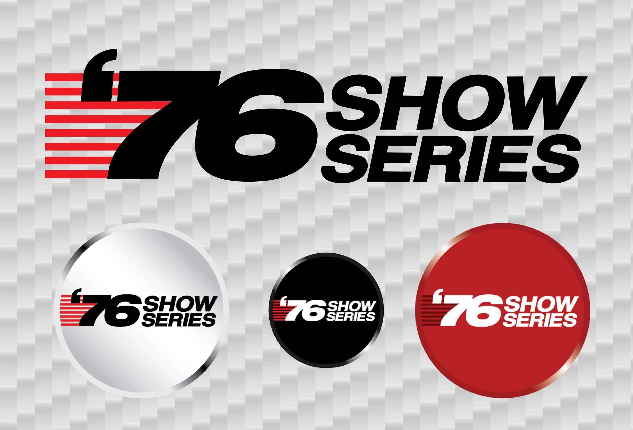
Logo Suite
Typography
Patterns & Imagery
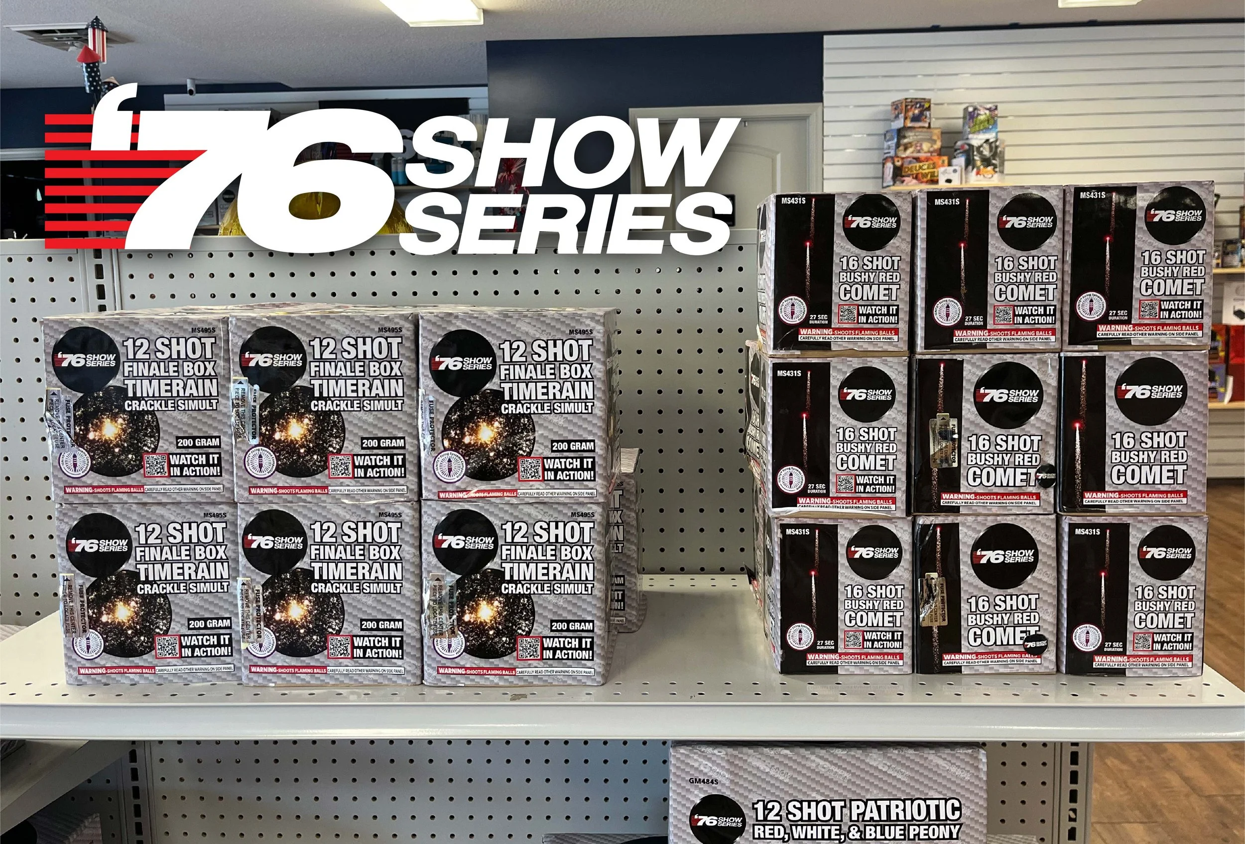
50+ Label Designs
Insight
In a category where everything is loud, restraint becomes the loudest signal.
Instead of competing with traditional fireworks packaging, the strategy was to invert the expectation. A minimal, largely monochromatic system could create a strong block presence at retail, unify the entire product family, and communicate confidence and premium quality. By reducing visual noise, the brand would feel modern, intentional, and easier to recognize across the shelf.
Design Intent
The design focused on building a disciplined visual system that could scale across the full product line. A bold monochromatic palette created strong shelf recognition while keeping the series visually unified. Clean typography and structured layouts replaced the typical fireworks visual overload. The packaging was built as a modular system so new products could easily be added while maintaining consistency. Rather than depicting complex type treatments and overstimulating artwork, the design communicates clarity, performance, and confidence.
Outcome
The launch of ’76 Show Series exceeded expectations across both retail performance and brand impact. The entire product line sold out within three weeks of launch, and the products now sell roughly 40% better than when they were part of ’76 Pro Line. The unified visual identity created immediate shelf recognition, and retailers reported that the packaging stood out quickly among traditional fireworks designs.
Most importantly, the new brand allowed consumer-accessible fireworks to reach a wider audience without compromising the professional identity of ’76 Pro Line.


This project was produced while in the employ of Spirit of ‘76 Fireworks as their Graphic Designer.