
Fireworks Product Label Design
Spirit of ‘76 Fireworks | In-House Graphic Designer
The Brief
Spirit of ’76 Fireworks produces a large catalog of consumer fireworks across several distinct product lines, each aimed at different audiences. Packaging must capture attention on crowded shelves while reinforcing the identity of the specific brand line it belongs to.
I designed a wide range of bespoke product labels and packaging graphics across this catalog, adapting illustration styles, typography, and tone to fit each product family. Because the catalog contains hundreds of individual items, the work focuses on creating range within a product system.
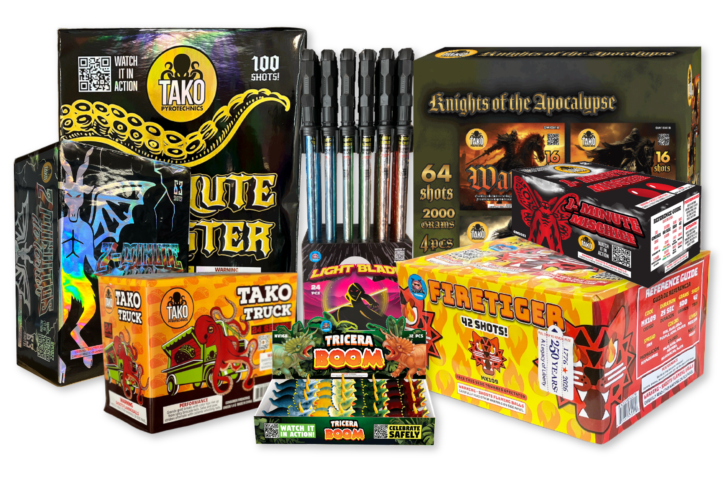
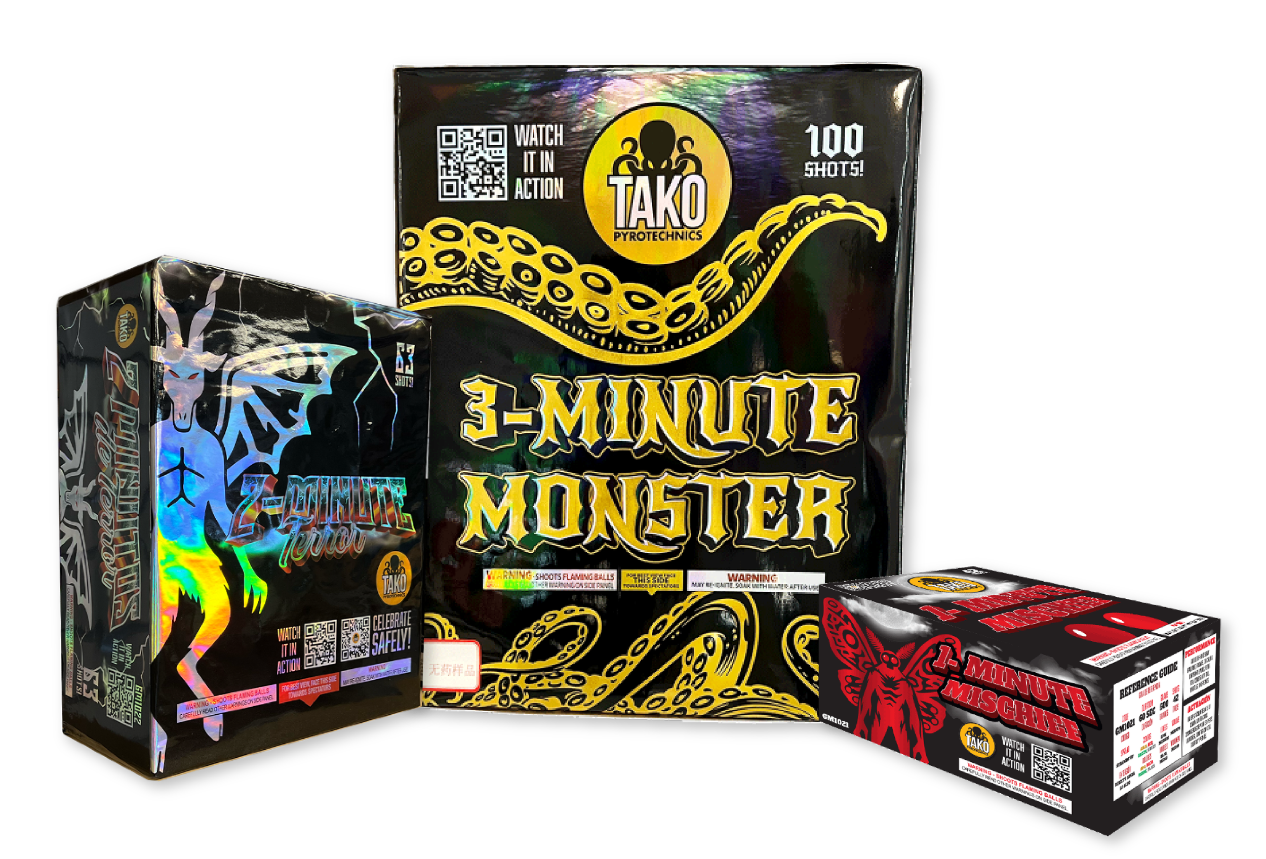
Featured examples include work for Sky Bacon, a playful line aimed at families and younger consumers, and TAKO Pyrotechnics, a darker, more irreverent brand targeting adult buyers.
Client
Spirit of ‘76 Fireworks
Industry
Retail / Pyrotechnics
Timeline
~2 weeks per Label
Status
Complete
Problem
Large fireworks catalogs can easily become visually inconsistent when each product is designed independently. At the same time, every item still needs to stand out individually in a crowded retail environment.
Spirit of ’76 also manages multiple product lines with very different audiences. Sky Bacon requires bright, playful visuals suited for younger consumers, while TAKO Pyrotechnics leans toward darker humor and edgier themes. The challenge was creating labels that felt unique at the product level while maintaining clear visual cohesion within each brand line.
Insight
Strong product lines are built through consistent visual language.
By reinforcing the tone and personality of each brand through illustration style, typography, and color choices, individual labels could remain distinctive while strengthening the identity of the larger product line.
Custom Illustration
Image Generation
Patterns & Typography
300+ Label Designs
Design Intent
Each product label was developed as a bespoke design built around its concept while aligning with the tone of its parent brand.
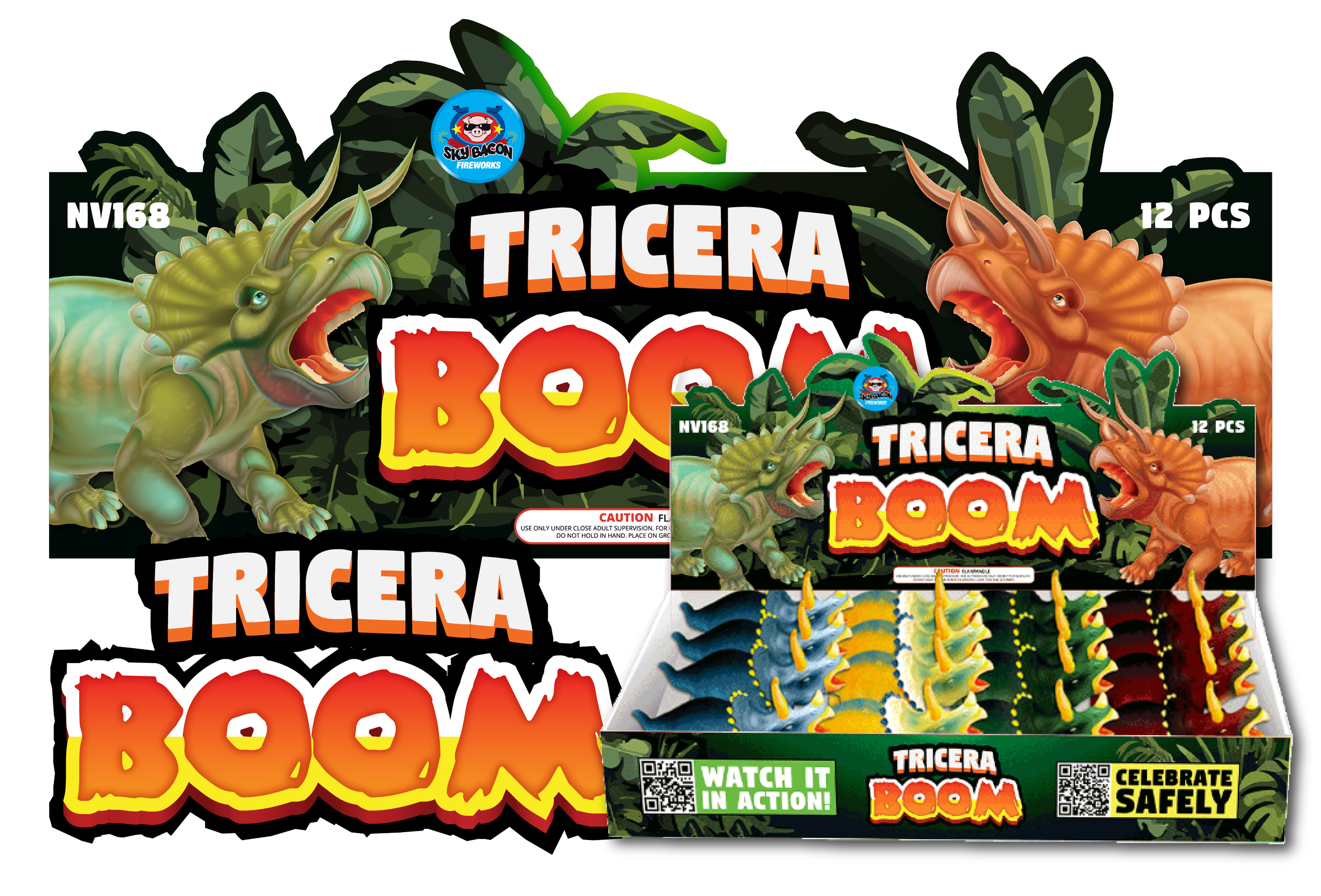
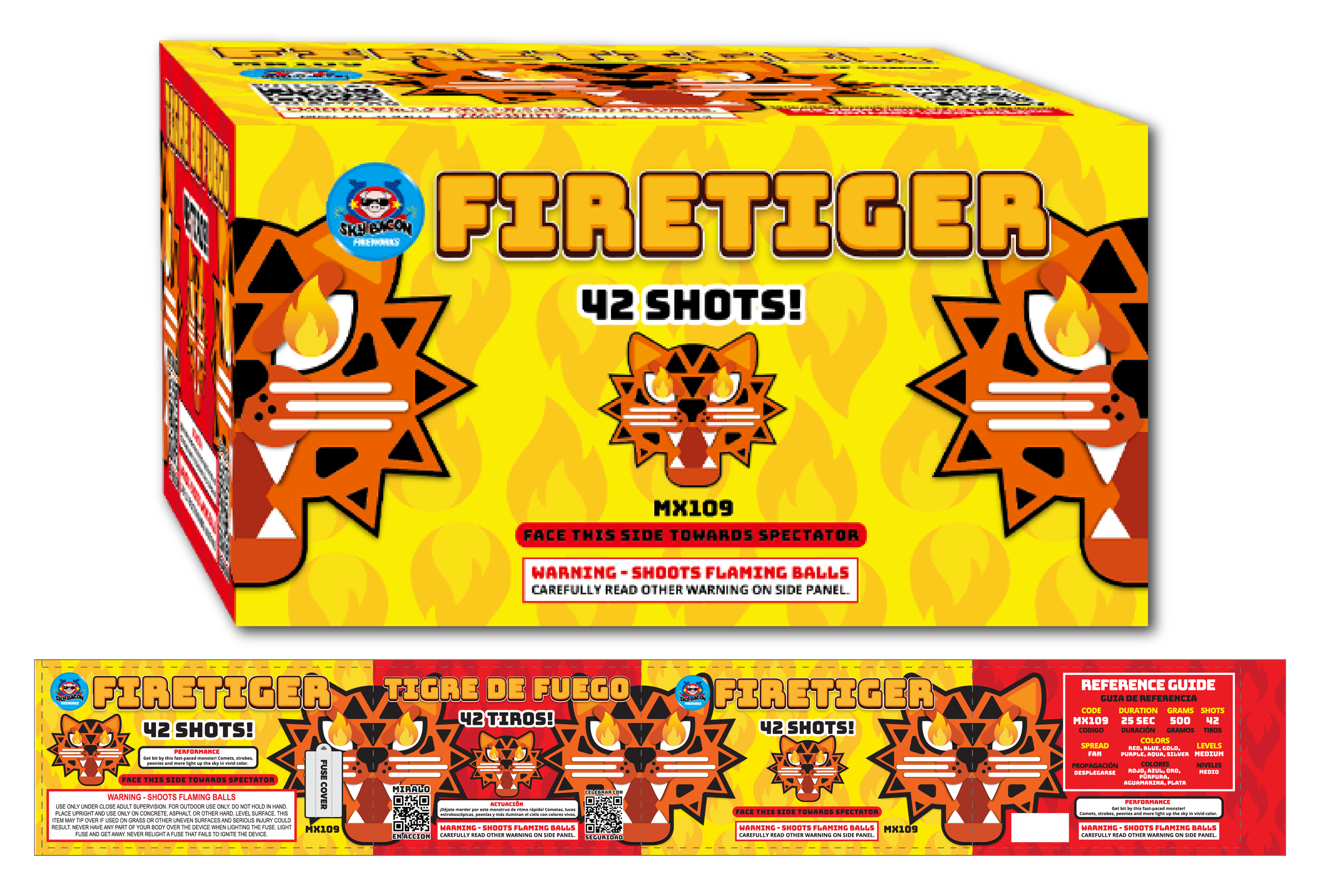
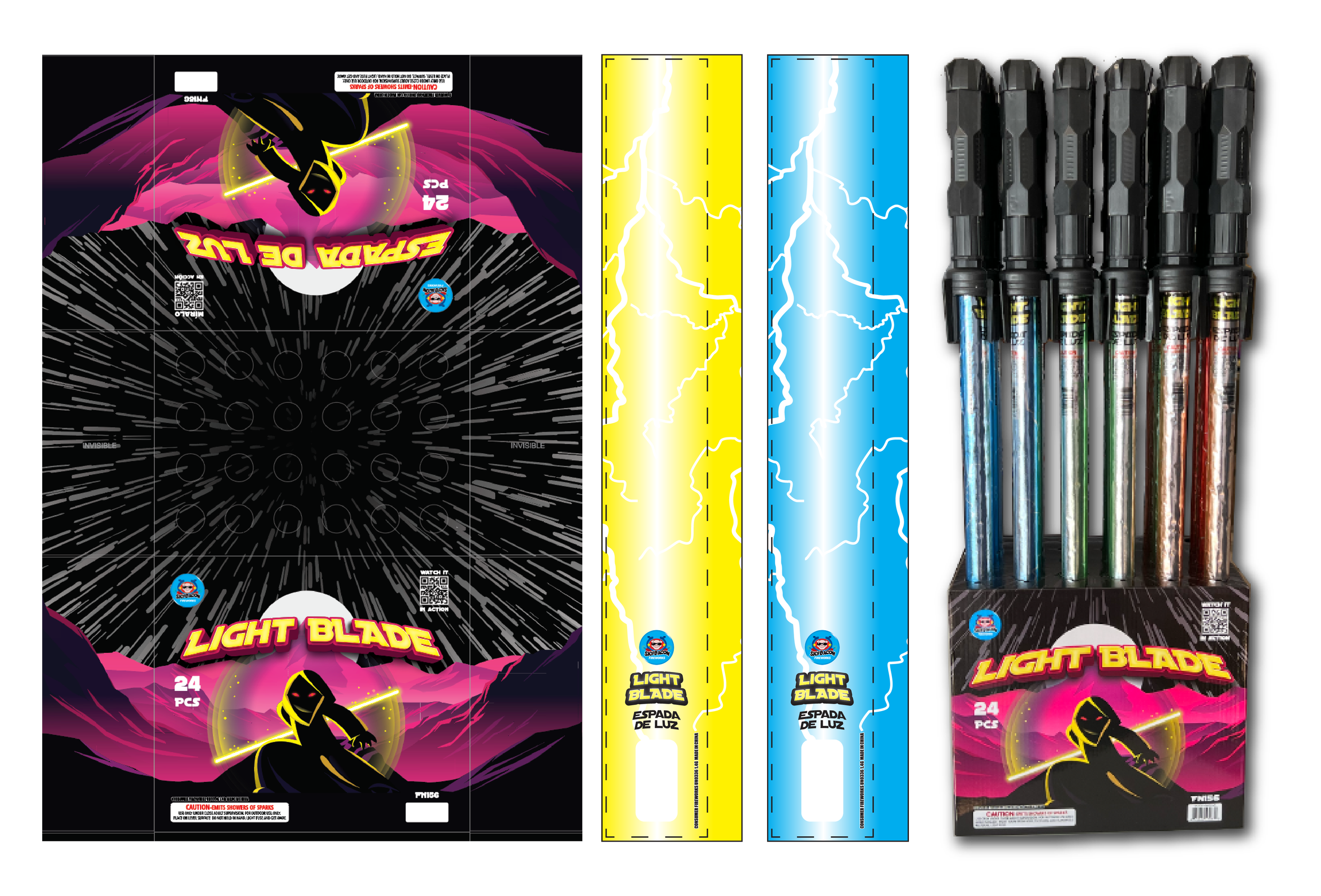
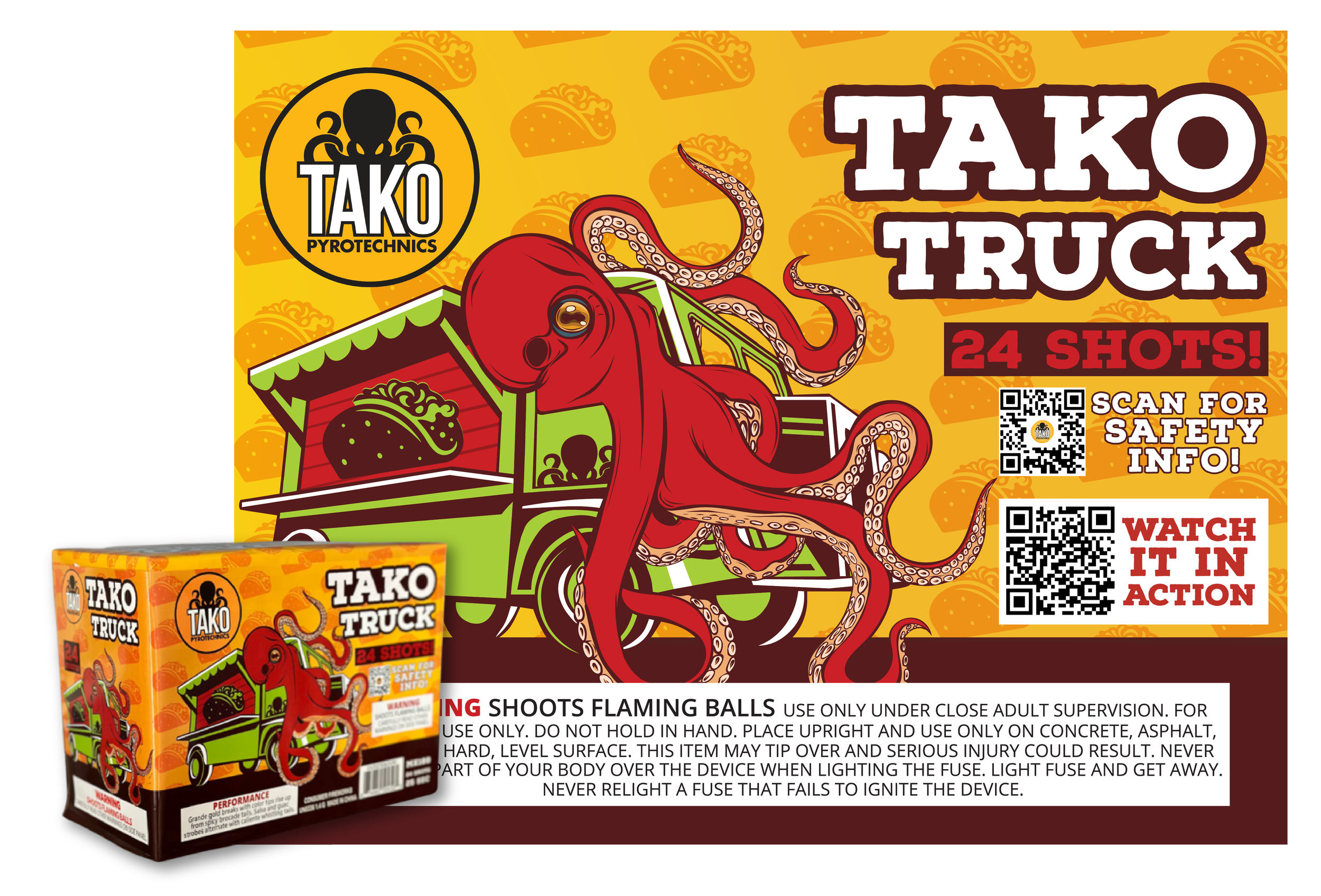
Sky Bacon designs emphasized playful, toy-inspired visuals, including updated packaging for Firetiger and novelty products like Lightblade and Tricera BOOM. TAKO Pyrotechnics leaned into darker themes and stylized typography, such as the Knights of the Apocalypse four-piece set and the gag product Tako Truck. Additional work included the cryptid-inspired series 1-Minute Mischief, 2-Minute Terror, and 3-Minute Monster, which scale in size while referencing creatures like Mothman, the Jersey Devil, and the Kraken.
Outcome
The updated packaging contributed to measurable improvements in product performance and brand cohesion.
Several Sky Bacon products saw sales increase by approximately 32% after receiving updated designs, while some newly introduced products sold up to 20% better than projected.
As the TAKO Pyrotechnics brand became more visually cohesive, some retailers increased bulk orders by as much as 60%.
This project was produced while in the employ of Spirit of ‘76 Fireworks as their Graphic Designer.